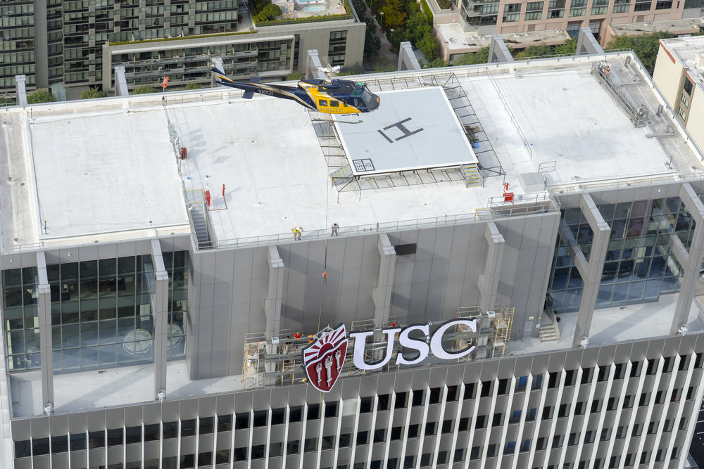
USC Signage / Downtown LA - Photo: Gus Ruelas
University Rebrand
CASE STUDY: University of Southern California
Rebranding an established university is not for the faint of heart. In 2011, I led the University of Southern California’s first enterprise-wide rebranding project in nearly three decades. Starting with an audit of USC’s previous graphic identity, expertly designed by Saul Bass, it was clear that the university’s identity system had degraded, no longer fitting with the stature and trajectory of a major international research institution.
With less than six months to complete and launch, I partnered with Pentagram Design to overhaul USC’s graphic identity program, redesigning it from a series of disparate logos for schools and institutes that seemingly had no affiliation to one another, to a typographic system with consistency in naming and nomenclature, fonts, styles, and colors.
As the largest private employer in Southern California, the implementation of USC’s identity was perhaps the most important element for a successful rebrand — it had to reach thousands of end-users, throughout several campuses, world-wide. The implementation of the redesigned graphic identity was the first step in rebranding, and establishing and enforcing new guidelines was the key. All internal and external communication mediums had to be restructured and rebranded to follow guidelines, leading to the redesign of publications, websites, letterhead, busses and transportation, packaging, billboards, merchandise, and signage. Below is just a sampling.
USC Primary Logo
USC Logo System, Launched 2011
Implementation of the graphic identity system to rebrand USC
USC Residential Colleges Branding - Creative Direction: Sheharazad Fleming / Crest Designs: Julie Savasky / Gif: Meiko Arquillos